Building My Design System — From Intuition to Structure
This project explores how a structured design system can support scalable UI development.
I built a token-based foundation, layout rules, and reusable UI elements to better understand how modern products maintain consistency, theming, and layout flexibility.
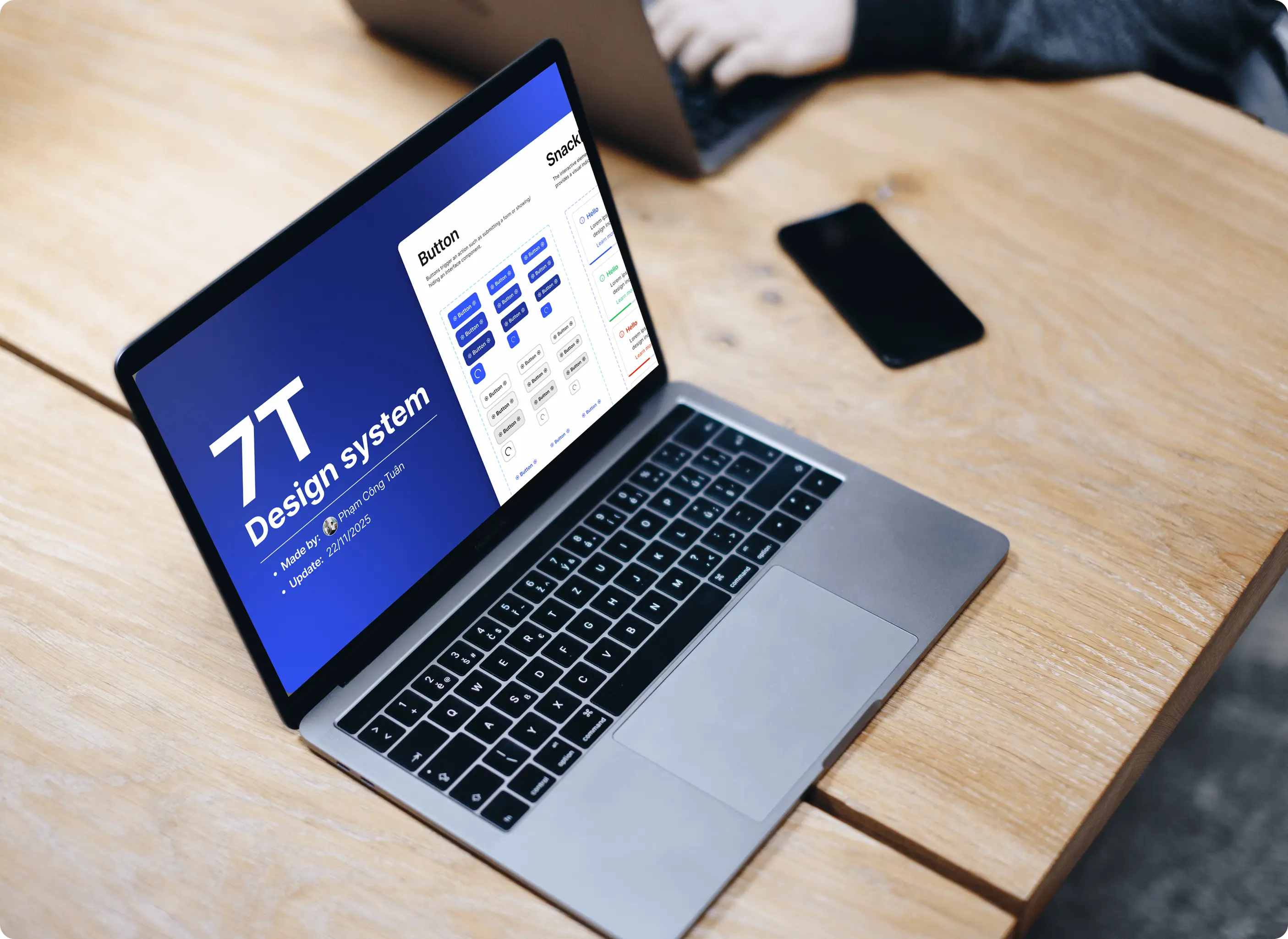
Overview
Role: UI UX Designer (End-to-end)
Focus: Design system foundations, token architecture, layout systems (spacing & grid), and scalable components
Duration: 2 Weeks
Platform: Web application (Responsive)
What I Built
For this project, I designed and built the foundation of a design system from scratch, starting with tokens and layout rules.
Key elements:
• Design token system for colors, spacing, and typography
• Spacing and grid foundations for consistent layouts
• Reusable components built with Auto Layout, variants, nested components, and boolean properties
• Integrated icon and illustration libraries from external sources
• Applied the system to real UI layouts to test consistency
Context & Problem
At the company, most interfaces were built using a customized Angular component library. My work mainly involved extending existing components and building responsive layouts.
While this allowed quick UI delivery, I didn’t fully understand how design systems scale or how UI elements connect behind the scenes.
After seeing examples where themes, spacing, and typography could update automatically, I realized these systems rely on design tokens and structured foundations.
To better understand this architecture, I started building my own design system foundation and applying it to interface layouts.

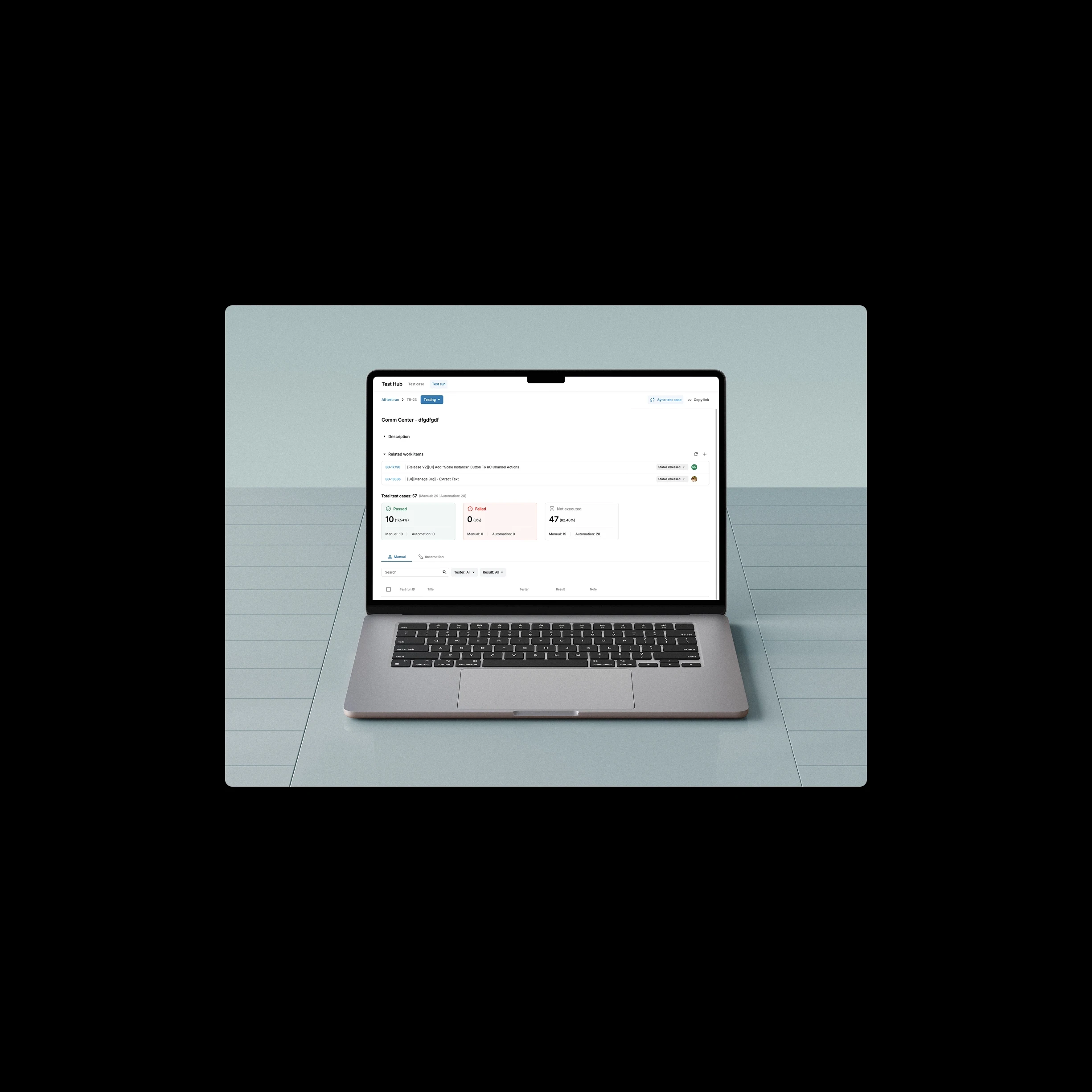
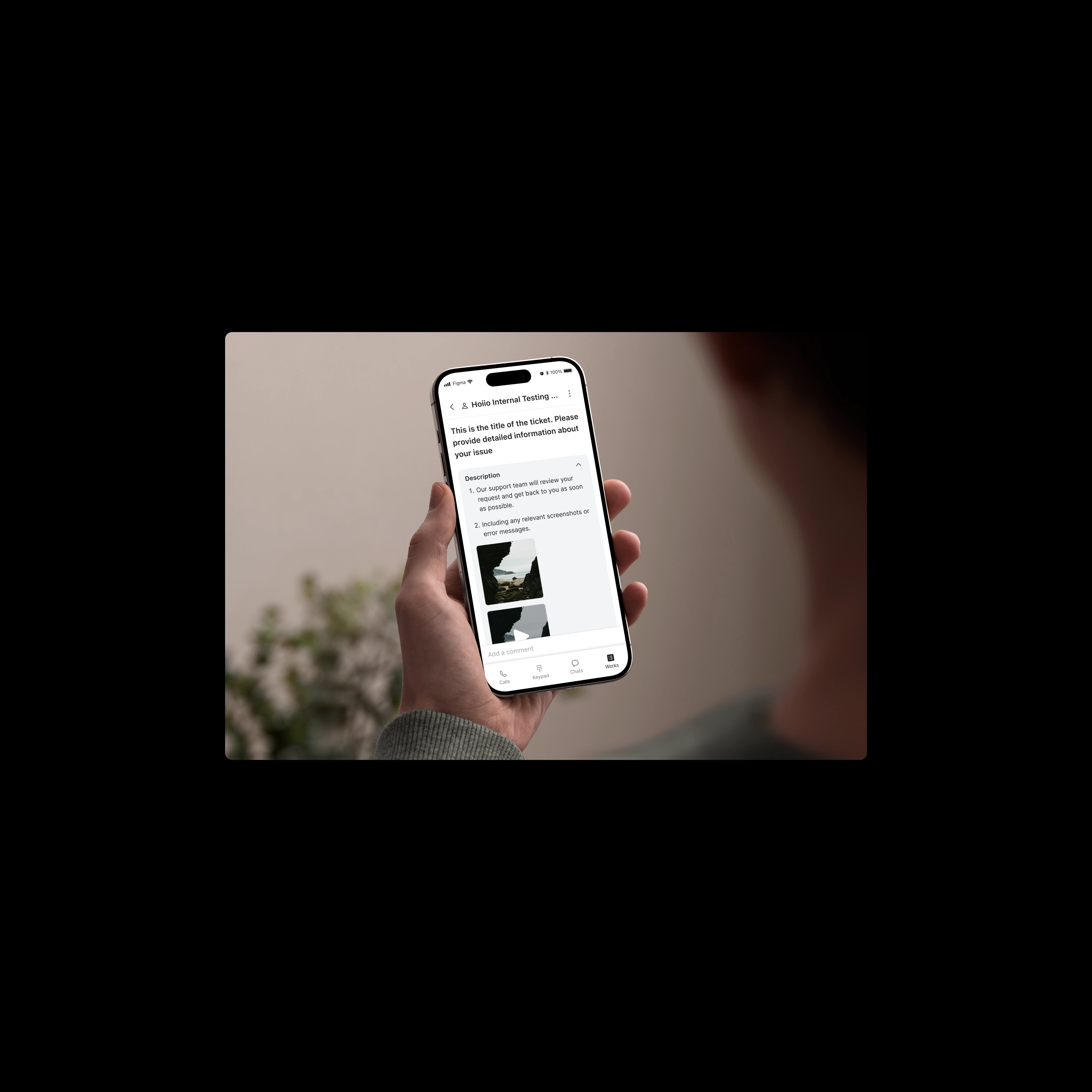
*Examples of components from the company’s design system
Key issues:
Limited understanding of the design system structure
Unclear how tokens and components scale across interfaces
Lack of a clear foundation for consistent UI patterns
Design Solution
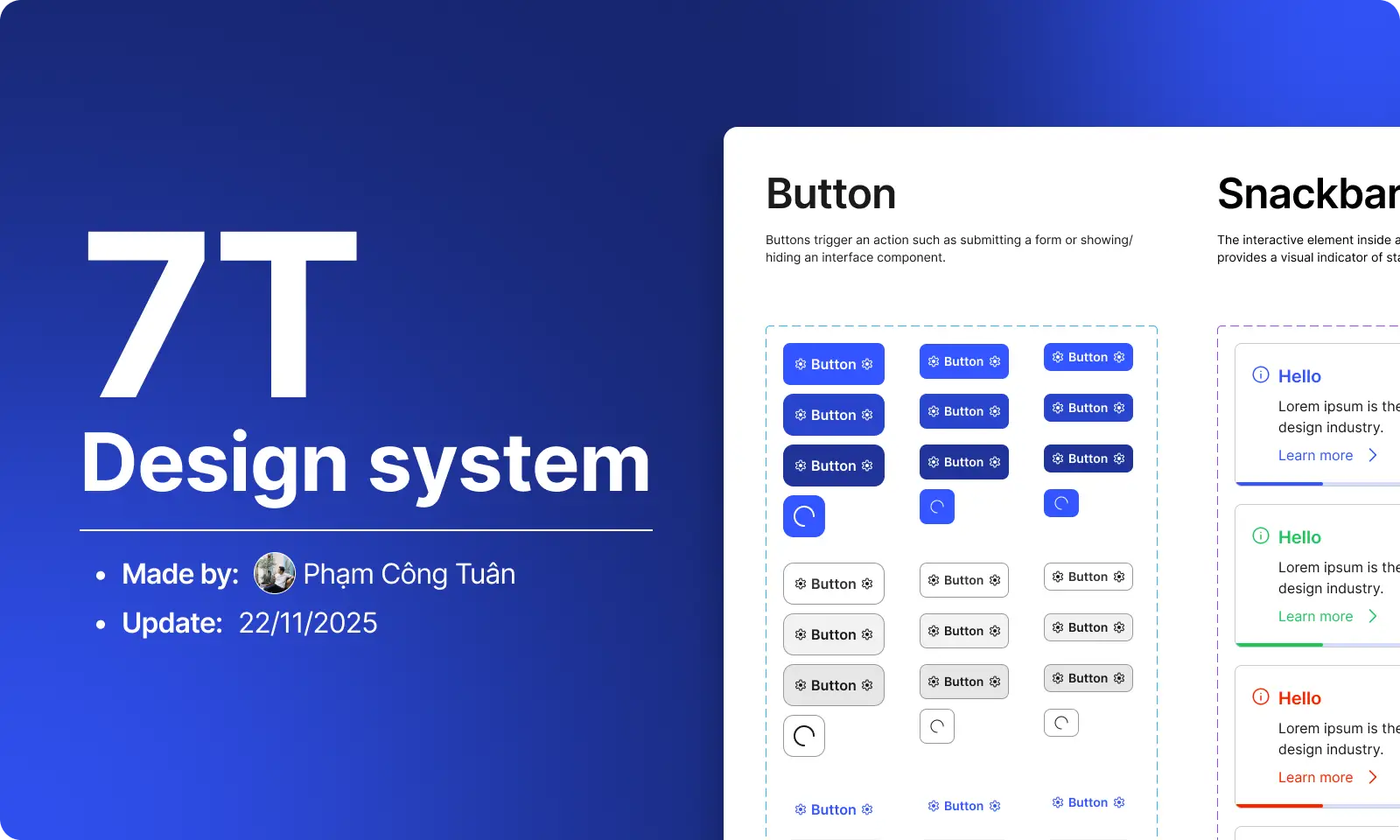
To better understand how design systems structure and scale UI, I built a design system foundation based on tokens, layout rules, and reusable components. This allowed me to explore how visual values and UI elements can be organized into a structured and scalable system. The foundation is organized into three layers.
Token Foundation
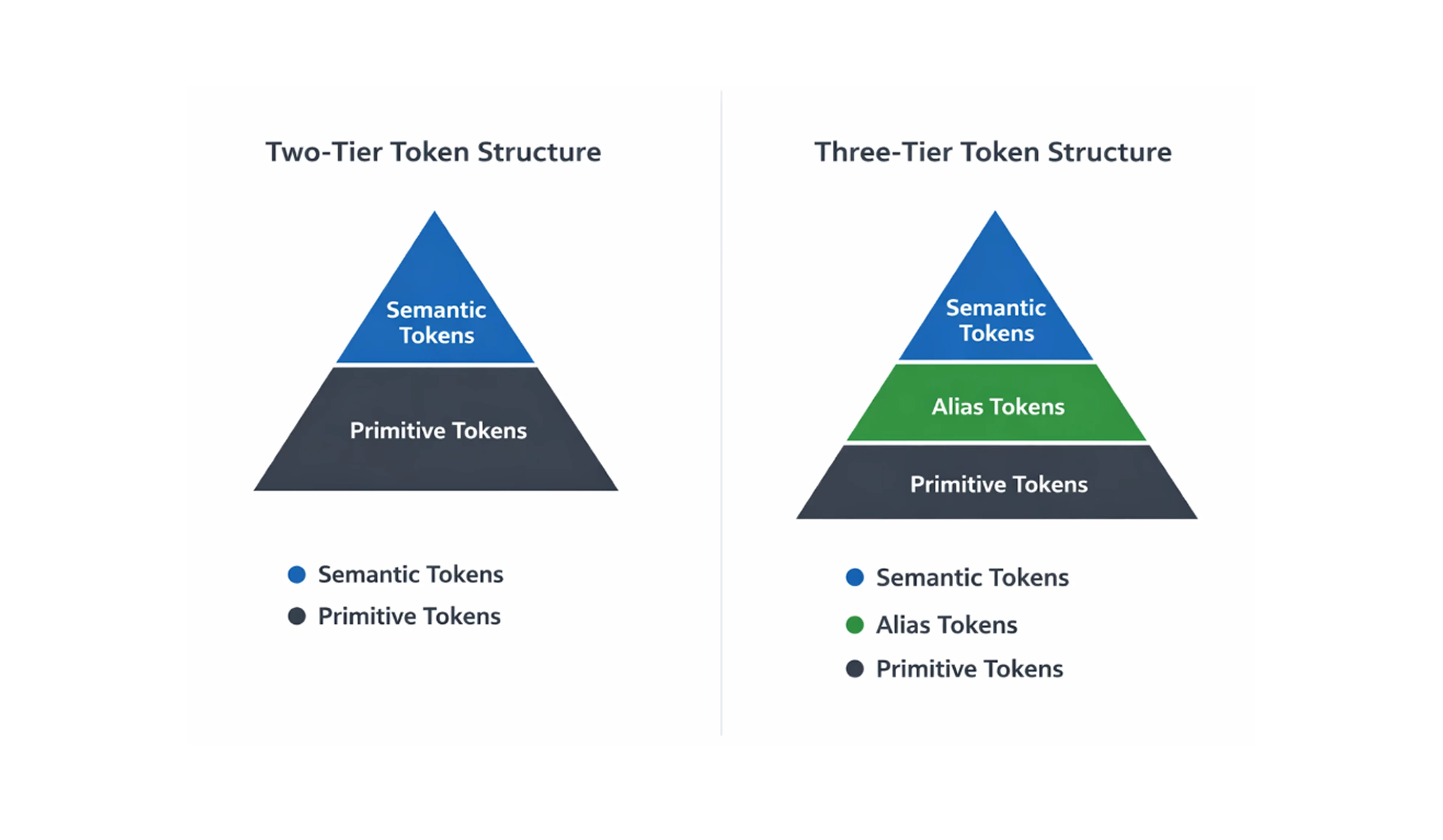
The current system uses a two-tier token structure. Primitive tokens store raw values such as colors, spacing, and typography, while semantic tokens map those values to UI meaning. This structure centralizes visual values and keeps UI elements consistent across layouts.

Layout & Visual Foundations
To ensure consistency across interfaces, I defined a set of layout and visual rules, including:
Spacing and gap system
Grid layout structure
Typography scale
Border radius and stroke styles
These foundations help maintain consistent alignment, rhythm, and visual hierarchy across UI layouts.

Component System
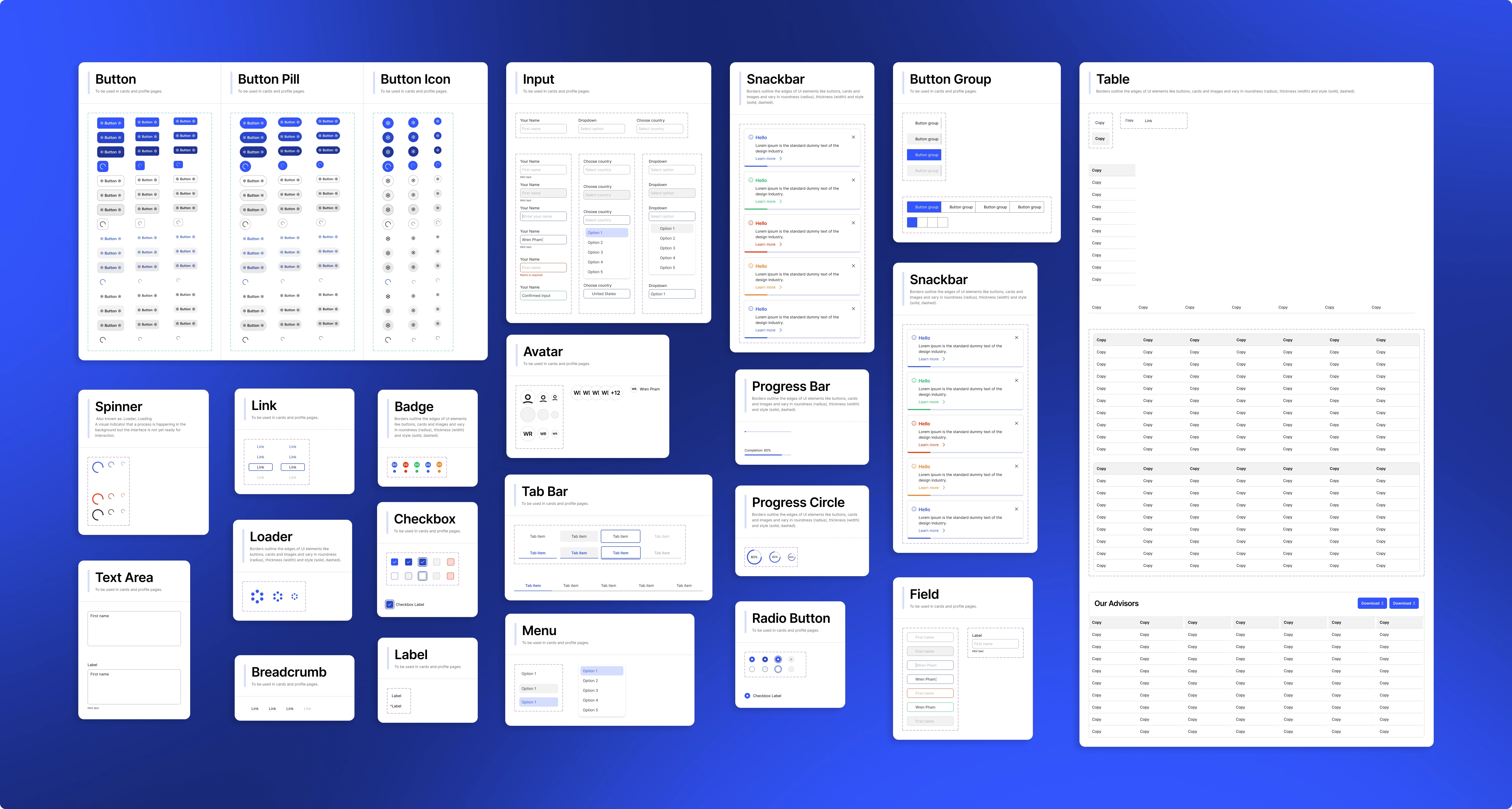
Reusable components were built manually using Auto Layout, variants, nested components, and boolean properties, allowing flexible configurations while maintaining consistency.
Visual Assets
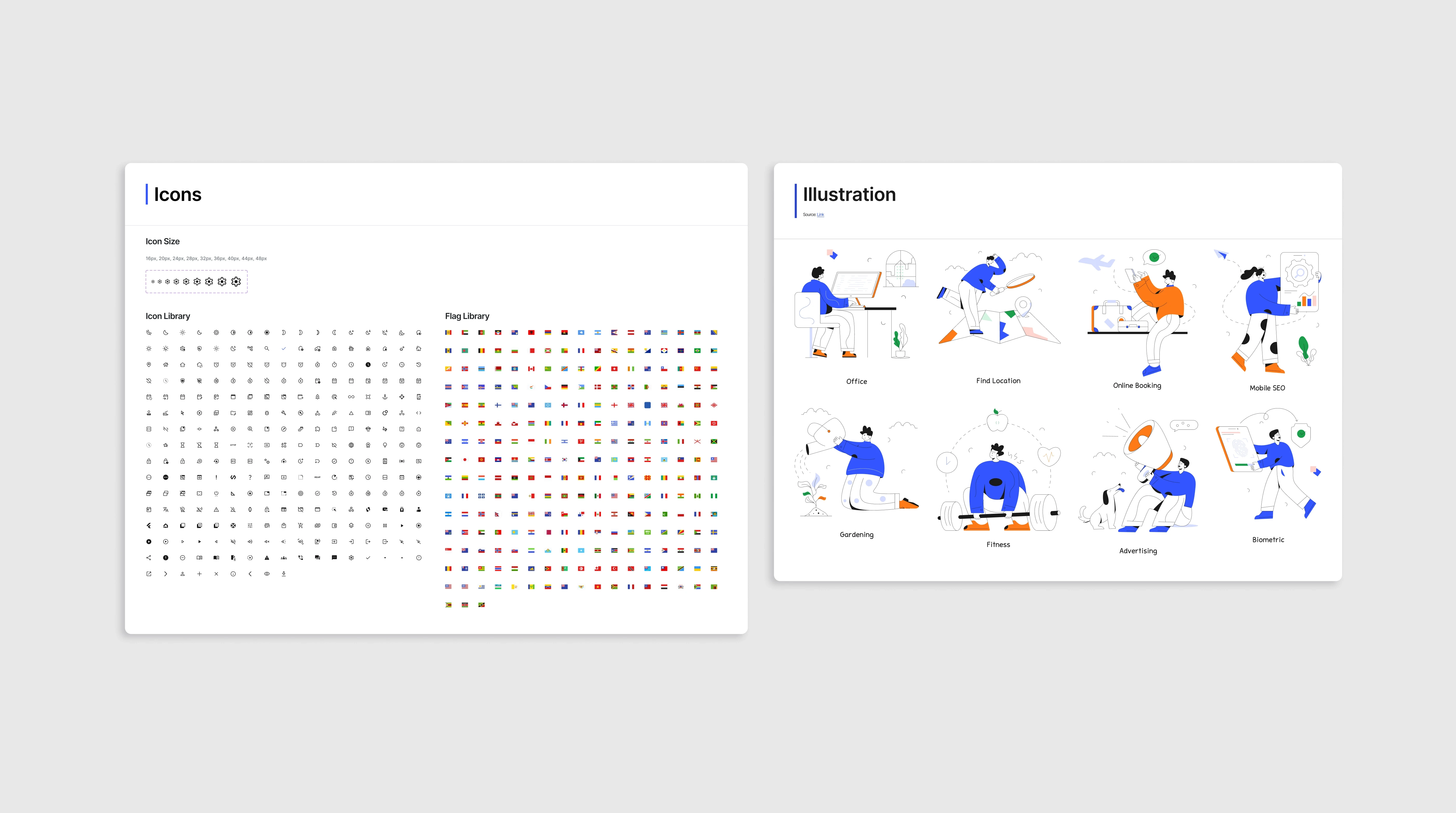
The system also integrates icon and illustration libraries from external sources, organized to support consistent visual usage across the interface.
Applying the design system
After building the tokens and components, I wanted to see how the system would work in a real screen.
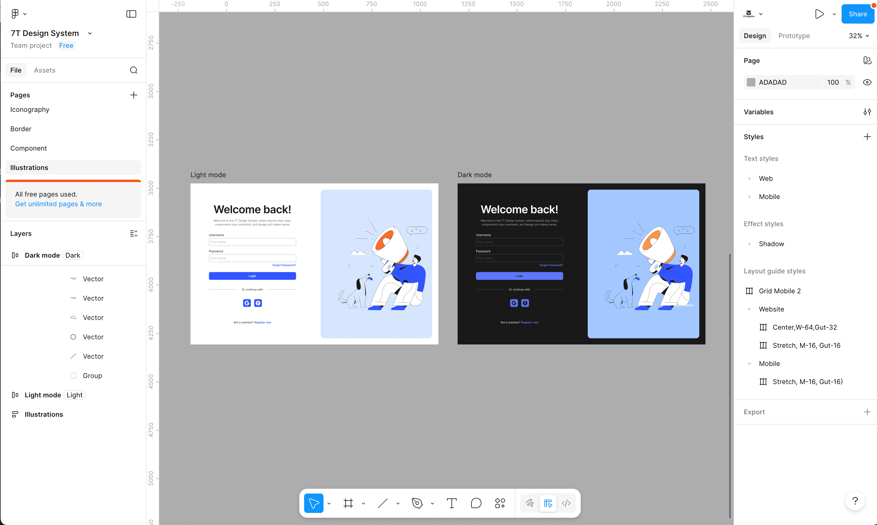
So I created a simple login page using only the styles and components from the design system.
Since the colors were defined with semantic tokens, the UI could switch between light mode and dark mode without redesigning anything. This small test helped me understand how a design system keeps the interface consistent and easier to maintain.
Reflection & Next Steps
Building this project helped me realize that design systems evolve gradually, starting from small building blocks. The first version focused on establishing a two-tier token structure, which provided a basic foundation for organizing visual values.
However, after reviewing the system, I noticed several areas that could be improved, particularly in token structure and scalability. This led me to start rebuilding the system using a three-tier token architecture (Primitive → Alias → Semantic) to create clearer separation and better flexibility.
As a next step, I also plan to turn the design system into a small documentation website, making it easier to explore tokens, components, and usage guidelines.
This project taught me that design systems are never static. They evolve through continuous review and refinement.